If you have a question to ask or an idea to share, come and participate in Adobe XD Community. We would love to hear from you and see your creations.
- Adobe XD User Guide
- Introduction
- Design
- Artboards, guides, and layers
- Shapes, objects, and path
- Text and fonts
- Components and states
- Masking and effects
- Layout
- Videos and Lottie animations
- Prototype
- Create interactive prototypes
- Animate prototypes
- Object properties supported for auto-animate
- Create prototypes with keyboard and gamepad
- Create prototypes using voice commands and playback
- Create timed transitions
- Add overlays
- Design voice prototypes
- Create anchor links
- Create hyperlinks
- Preview designs and prototypes
- Share, export, and review
- Share selected artboards
- Share designs and prototypes
- Set access permissions for links
- Work with prototypes
- Review prototypes
- Work with design specs
- Share design specs
- Inspect design specs
- Navigate design specs
- Review and comment design specs
- Export design assets
- Export and download assets from design specs
- Group sharing for enterprise
- Back up or transfer XD assets
- Design systems
- Cloud documents
- Integrations and plugins
- Work with external assets
- Work with design assets from Photoshop
- Copy and paste assets from Photoshop
- Import or open Photoshop designs
- Work with Illustrator assets in Adobe XD
- Open or import Illustrator designs
- Copy vectors from Illustrator to XD
- Plugins for Adobe XD
- Create and manage plugins
- Jira integration for XD
- Slack plugin for XD
- Zoom plug-in for XD
- Publish design from XD to Behance
- XD for iOS and Android
- Troubleshooting
- Known and fixed issues
- Installation and updates
- Launch and crash
- Cloud documents and Creative Cloud Libraries
- Prototype, publish, and review
- Import, export, and working with other apps
Learn how to add multiple states to components in your design system to develop interactive content easily.
Components that change appearance based on user interactions are invaluable for creating high-fidelity prototypes.
You can create a component, add multiple variations (states) to it, and wire it to mimic real-world user behavior (without having to copy your components multiple times).
Having components with states also makes it easier to manage your assets and to create interactive design systems.


Common examples of components with states are buttons, checkboxes, and animated toggle buttons. These components need to change when users interact with them by tapping or hovering over them.
Add component states
Once you have created a component, the Property Inspector has a new section that lists the component with a Default State. You can now add three types of states for your components — New State, Hover State, or Toggle State. Read on to know how to add a state.
New State
Use New State for scenarios where you want to show variations of a component such as a disabled or clicked version of a component.
Click the + button next to the main component's Default State in the Property Inspector, and select New State.
New State does not have any interactivity baked into the state. You have to wire the interaction in Prototype mode. For more information, see Add interactivity to components.
Hover State
Use Hover State if you want your component to change and display a different state when a user hovers over the component.
In Design mode, click the + button next to the Main component's Default State in the Property Inspector, and select Hover State.
When using Hover State, you don't have to go to Prototype mode to wire the interaction. It's automatically done for you.
Toggle State
Use Toggle State when you want to create components with interactive toggle behavior such as toggle, radio button, checbox and so on.
In Design mode, click the + button next to the Default State of the Main Component in the Property Inspector, and select Toggle State.
Once the toggle state is created, by default, XD will automatically bake in two bi-directional Tap interactions between the Default State and the Toggle State, making it fully interactive.


![]() You can add states only to a Main component. Component instances always inherit their states from the Main component.
You can add states only to a Main component. Component instances always inherit their states from the Main component.
Visualize components in different states
After you create the states for your component, you can edit the properties of your component and visualize how your component appears to the user who interacts with it.
- Select the component.
- Go to Property Inspector and toggle or switch between various states.
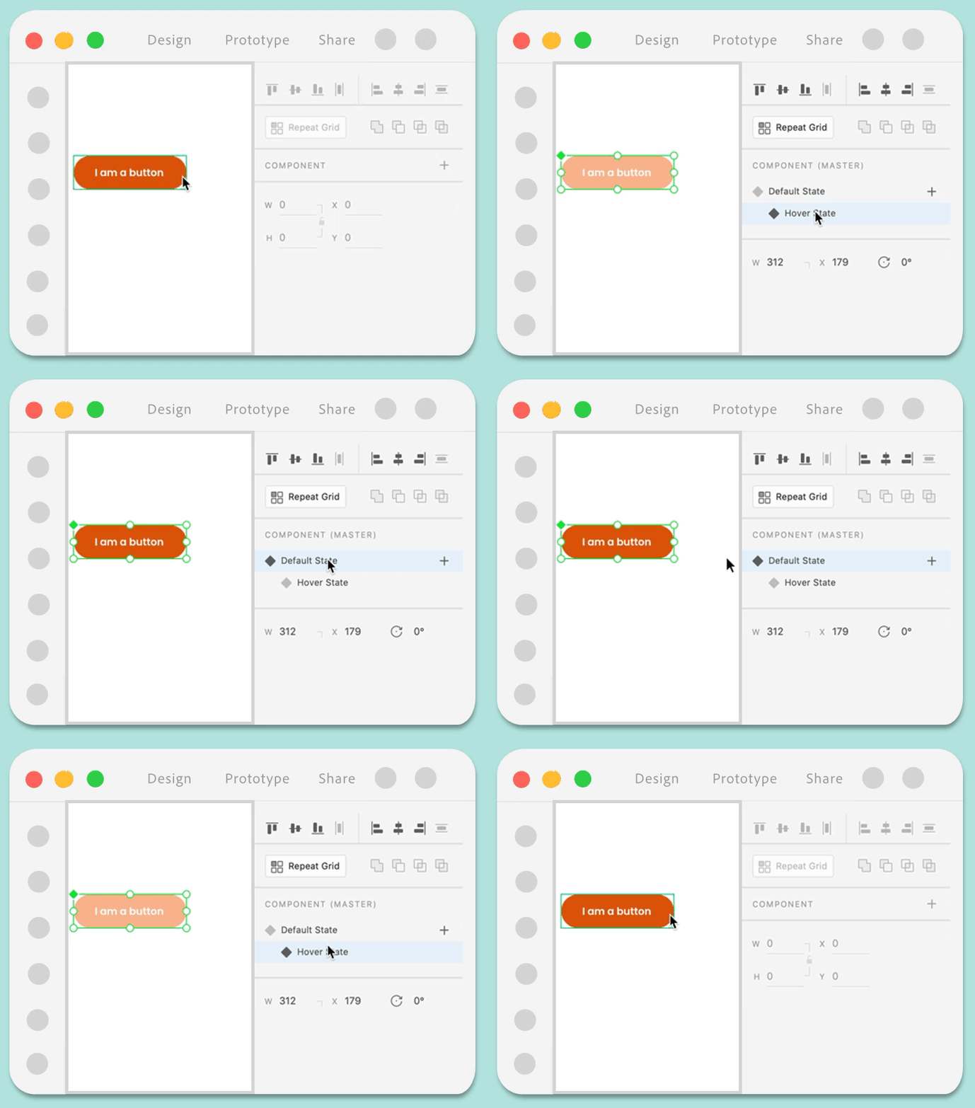

Add interactivity to components
You can use Tap, Hover, Keys & Gamepad, and Voice triggers for wiring interactions between component states in the Prototype mode. Wiring interactions between component states is similar to wiring interactions between artboards. The main difference is that when wiring interactions between component states, you choose a state as a destination instead of an artboard.
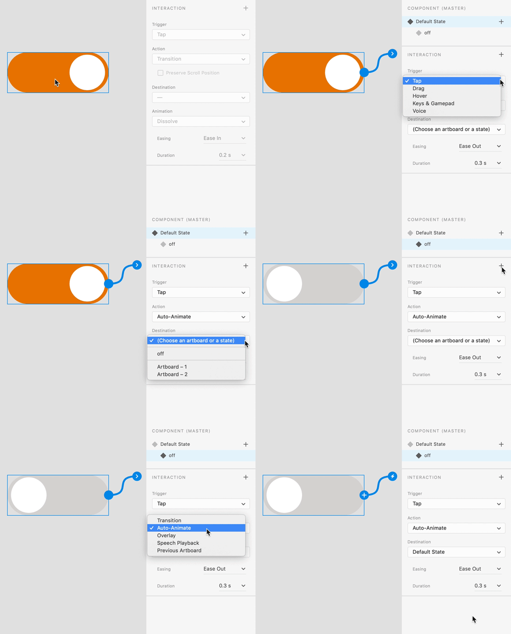

- Switch to the Prototype tab.
- Select the component state from which you want to create the interaction.
- Click the > icon on the component state or the + in the Interaction section in the Property Inspector to add an interaction.
- Choose Tap (for click events), Hover (for mouseover actions), Keys & Gamepad (navigation and accessibility use cases), or Voice (navigation and accessibility use cases) as a trigger.
- Pick an action type (such as Auto-Animate or Transition).
- Pick a state as the destination.
- Switch to the Preview window and test your Component's interactivity.
![]() States are listed above the artboards in the dropdown separated with a divider.
States are listed above the artboards in the dropdown separated with a divider.


You can define multiple interactions for the same component state. For example, if you have a toggle switch that has a default on state, an off state, and a hover state, you can define separate interactions on the default state. Repeat the steps 4-7 to define the interaction with the additional state. After you create multiple interactions, you can see the Interaction section displaying the defined interactions. Toggle between those interactions and modify the interaction properties to fit your requirements.
Edit component states
When you define an interaction on a Main component state, all instances of that component automatically inherit those interactions. This means if you wire a component to a specific artboard or state, all instances of that component also contain those interactions.
When you have an instance selected on canvas and you want to edit existing states or add new states to the Main component, you can do so through one of the following options:
Option 2
Click Edit to switch the selection to the Main component to add or edit states.
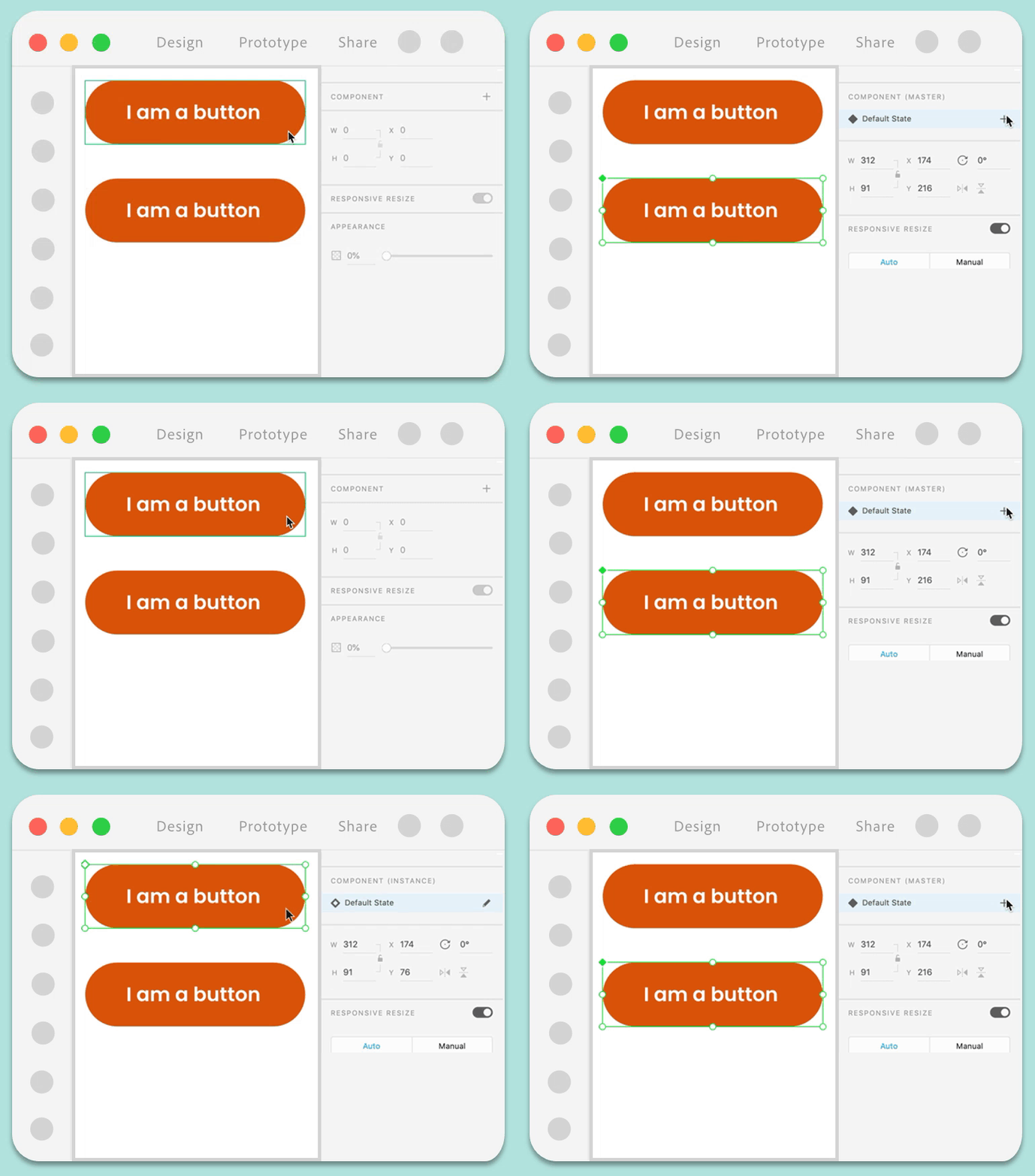

Option 1
Right-click the component instance and select Edit Main Component.
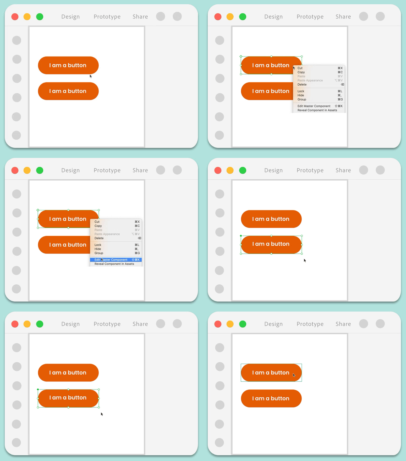

Component instances are linked with the main component. Changes to a main component cascade to the instances. For more information, see Manage components with a single source.
Rename, reorder, and delete component states
Rename a component state: Double-click the component state name in the Property Inspector and type in a new name.
Reorder main component states: Drag the states of a main component in the Property Inspector to reorder them.
Delete a component state from a main component: Right-click the component state and select Delete. When you delete a component state from the Main component, component instances that have that state active on canvas switch back to the Default State.
![]() You can only rename and delete states in the Main component. You cannot rename the Default State.
You can only rename and delete states in the Main component. You cannot rename the Default State.
Publish and share component states
You can publish components and its associated states to a Creative Cloud Library from the Libraries panel and distribute them as part of a design system. For more information, see Work with Creative Cloud Libraries in XD.
Manage components with a single source
To simplify the management of component states, you can only add, rename and delete states from a Main component. Instances of that component automatically inherit any state changes made in the Main component. You can easily identify the Main component from the green filled diamond on canvas or from the Component section in the Property Inspector. Instances have a hollow green diamond.
Inheritance of component states
Follow these principles while editing states across Main components and instances:
- You can override properties (text, bitmap, size, appearance, or structure changes) for states just like you can override a component instance.
- When you edit the state in a Main component, that state updates across all instances.
- When you edit the state in an instance, it is treated as a unique override and no longer syncs that property with changes from the main state.
If you are not happy with the results of your overrides, reset it back to the original Main component by right-clicking an instance and selecting Reset to Main State. This clears all overrides on an instance and resets it back to the Main component.
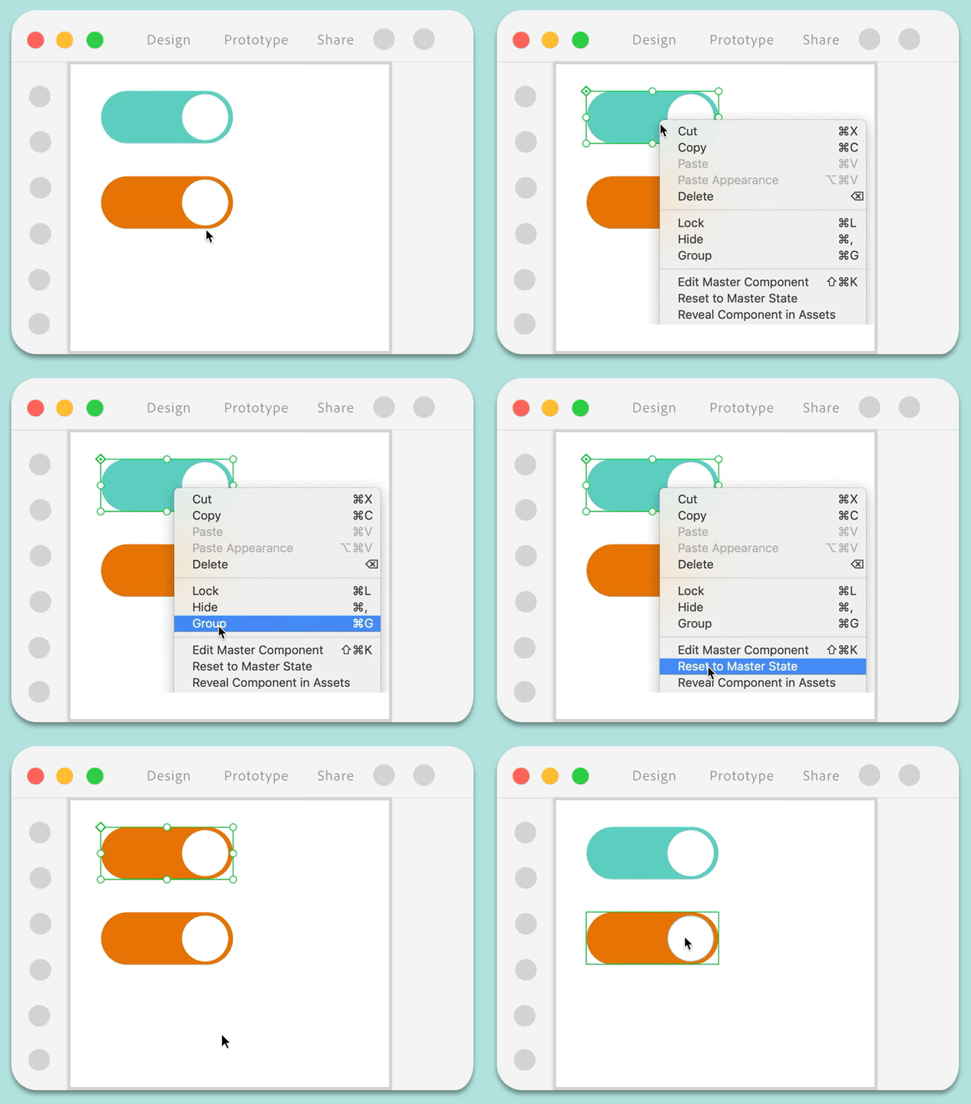

For more information on how component overrides work, see Work with components in XD.
Linked component states across documents
You can create and maintain a single source for all your reusable components along with their states and defined interactions. For example, if you have a button component with 5 defined states: Primary, Secondary, Hover, Tap, and Disabled states, when you copy and paste that component across documents, XD creates a linked component that maintains all the defined component states along with the state interactions.
If you change your linked component properties (styling, interactions, and so on) in the source document, XD notifies documents with instances of that linked component with those updates. From there, you can preview the changes and choose to accept or ignore them.
![]() Linked Components only support interactions defined between states and not artboards.
Linked Components only support interactions defined between states and not artboards.
Examples and sample files
Want to create a toggle switch that turns on and off when a user taps on it?
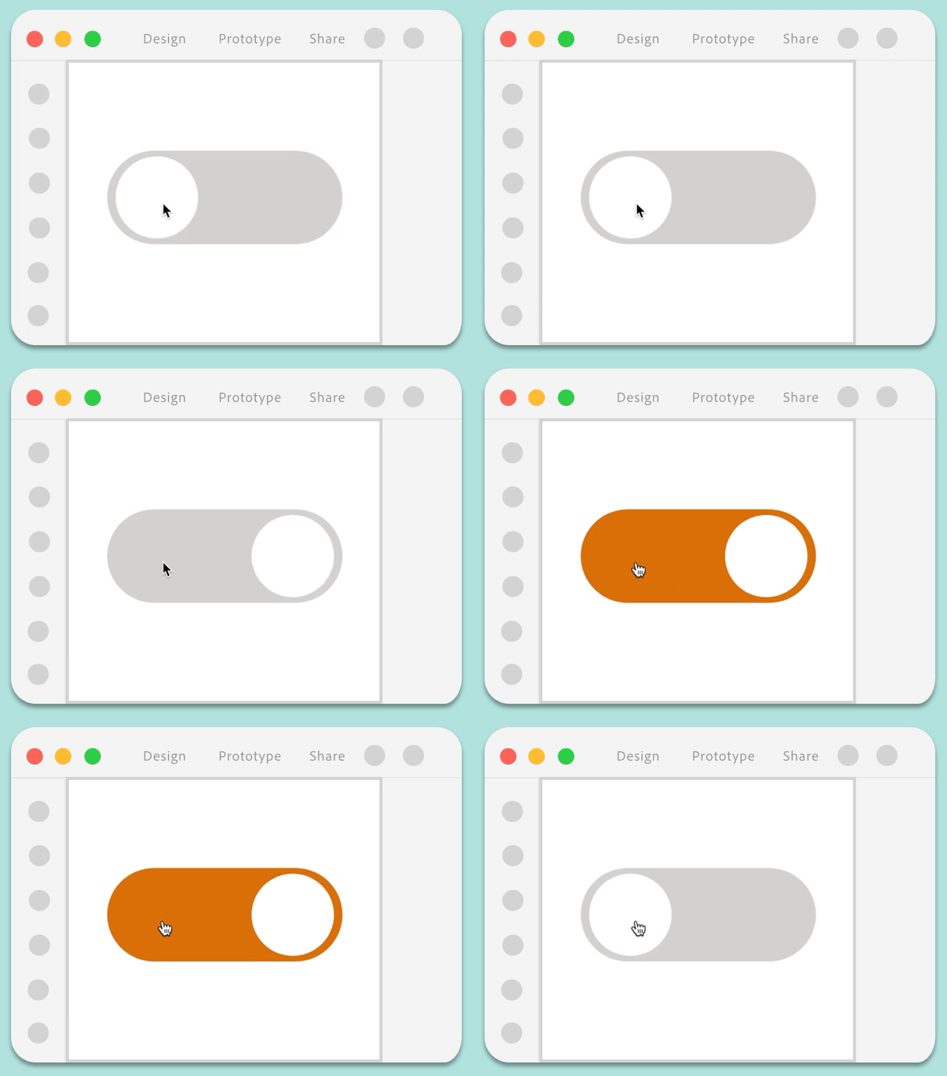

- Download the toggle button sample file and open it in XD.
- Select the entire object (make sure the circle is selected) and press Cmd + K (macOS) or Ctrl + K (Win).
- Add a new state and name it Disabled.
- In the Disabled state, select the Rounded rectangle and change the fill to gray. Select the circle and move it to the left.
- In Prototype mode, wire the following interactions:
- Default State: Set the Trigger to Tap, Action to Auto-Animate, and Destination to Disabled.
- Disabled State: Set the Trigger to Tap, Action to Auto-Animate, and Destination to Default State.
- (Optional): If you want the toggle button to glow on hover, select the component, add a Hover State, and then edit the component to have a glow effect.
Learn more
Watch this video to learn more about how you can build interactivity using components with states.
Viewing time: 7 minutes.
What's next?
We've got you started with using components with states. Follow this community post to learn how to use this feature to create checkboxes.
Have a question or an idea?