Switch to the Prototype tab.
- Adobe XD User Guide
- Introduction
- Design
- Artboards, guides, and layers
- Shapes, objects, and path
- Text and fonts
- Components and states
- Masking and effects
- Layout
- Videos and Lottie animations
- Prototype
- Create interactive prototypes
- Animate prototypes
- Object properties supported for auto-animate
- Create prototypes with keyboard and gamepad
- Create prototypes using voice commands and playback
- Create timed transitions
- Add overlays
- Design voice prototypes
- Create anchor links
- Create hyperlinks
- Preview designs and prototypes
- Share, export, and review
- Share selected artboards
- Share designs and prototypes
- Set access permissions for links
- Work with prototypes
- Review prototypes
- Work with design specs
- Share design specs
- Inspect design specs
- Navigate design specs
- Review and comment design specs
- Export design assets
- Export and download assets from design specs
- Group sharing for enterprise
- Back up or transfer XD assets
- Design systems
- Cloud documents
- Integrations and plugins
- Work with external assets
- Work with design assets from Photoshop
- Copy and paste assets from Photoshop
- Import or open Photoshop designs
- Work with Illustrator assets in Adobe XD
- Open or import Illustrator designs
- Copy vectors from Illustrator to XD
- Plugins for Adobe XD
- Create and manage plugins
- Jira integration for XD
- Slack plugin for XD
- Zoom plug-in for XD
- Publish design from XD to Behance
- XD for iOS and Android
- Troubleshooting
- Known and fixed issues
- Installation and updates
- Launch and crash
- Cloud documents and Creative Cloud Libraries
- Prototype, publish, and review
- Import, export, and working with other apps
Learn how to work with Components across design systems in Adobe XD.
Components are design elements with an unmatched flexibility that help you create and maintain repeated elements while varying the instances for different contexts and layouts like the usage of buttons in varying contexts.
Read on to learn how to use Components to easily maintain multiple versions of the same foundational element!


Familiarize yourself with these concepts before you proceed in XD:
To create a Component, select Object > Make Component. You can also select an object or group of objects and use any of these options:


Click the + icon in the Component section of the Property Inspector.


Click the + button in the Components section of the Assets panel.


Right-click an object and select Make Component (Ctrl/Cmd+K).
The first time you create a Component in XD, it becomes a Main Component, indicated by a green-filled diamond in the upper left corner. You can edit a Component just as you would edit any other element.


You can view the name of the selected component in the Property Inspector. To rename a component, double-click the name in the Property Inspector.
Things to watch out for
- XD does not have a dedicated view to edit Main Components. When you edit a Main Component, you edit it on canvas.
- If you delete a Main Component on canvas, you can still select an instance and access the Edit Main Component option in the context menu. XD will generate a Main Component on canvas.
- If you want to unlink a single Component instance, use the Ungroup Component option in the context menu. However, if you want to unlink all instances on canvas, use the delete option in the Assets Panel.
- To ensure that you're editing the Main Component, watch out for the green filled diamond in the upper left corner of the bounding box.
Best practices
Here are some best practices when working with Components:
- Creating a large design system of Components? Ensure to organize the related Main Components on separate artboards. For example, buttons on one artboard and navigational bars on another artboard.
- When building your design system, ensure to build the Components at the most atomic level for maximum flexibility and reuse. For example, when creating a dialog Component, ensure that the buttons for the dialog are Instances nested within the dialog Component.
Work with Component Instances
Every copy of the Main Component is known as an instance. Component instances are indicated by a green hollow diamond in the upper left corner. When you make changes to the Main Component, same changes are applied to all instances.


Overrides are unique changes that apply only to that instance and not the Main Component. If you change a property in an instance, XD marks that property as an override. You can override properties of an instance without breaking its connection to the Main Component.


Here are some best practices when working with Component instances:
- Do you want to experiment with a Component variation? Select Ungroup Component from the context menu to detach the instance from the Main.
- Are you trying to locate:
- All instances of a Component on canvas? Right-click the Component in the Assets Panel and select Highlight on Canvas.
- The Main Component while working with an instance? Right-click the instance and select Edit Main Component.
- The previous component instance after editing the main component? Right-click the component and select Back to Previous Instance.
Edit a Main Component
When you edit a Main Component, all instances are updated unless they contain overrides for that specific property.
To edit a Main Component, select an instance or Component on canvas, and use any of these options:


Right-click an instance on canvas and select Edit Main Component (Shift + Ctrl/Cmd + K).


Right-click a Component in the Assets panel and select Edit Main Component.


Select the edit pencil icon next to Default State in the Component section.
Once you're done editing the main component and want to return to the previous instance, right-click on the component and select Back to Previous Instance.
Things to watch out for
- Rotation and opacity properties don't propagate from the Main Component to instances.
- To ensure that you're editing the Main Component, watch out for the green-filled diamond decoration on the upper left corner of the bounding box.
Best practices
Here is a best practice when editing Main Components:
- If you delete a Main Component from the canvas, right-click an instance and select Edit Main Component. XD generates a Main Component on the canvas.
Override a Component Instance
Main Components provide the required consistency to maintain a design system. Any changes made to the Main Component automatically propagate to its instances. However, a design system is only as useful as the degree of flexibility it provides. You can start with the same original element, but you have to customize it depending on the context where it is used. That’s where instances come in.
Overrides are unique changes that apply only to that instance and not the Main Component. If you change a property in an instance, XD marks that property as an override. Overridden properties are always preserved, even if you edit the same property from the Main Component.
To clear overrides and reset the Main Component, right-click an instance, and select Reset to Main State.


Types of overrides
Here are some override types and their usage scenarios:
- Text: You can edit the text content in a Component instance, for example, when you change the label for a button Component.
- Bitmap: You can replace the bitmap content in a Component instance, for example, when you replace an image in a profile picture Component.
- Size: You can resize an instance when applying padding and responsive resize, for example, when you modify the size of the text fields in a form.
- Appearance: You can modify the appearance properties such as fill color, border, and blur, for example, when you modify the background color for notifications.
- Layout and structure: You can add, delete, and move objects within a Component instance, for example, when you modify the drop-down menus with additional menu entries.
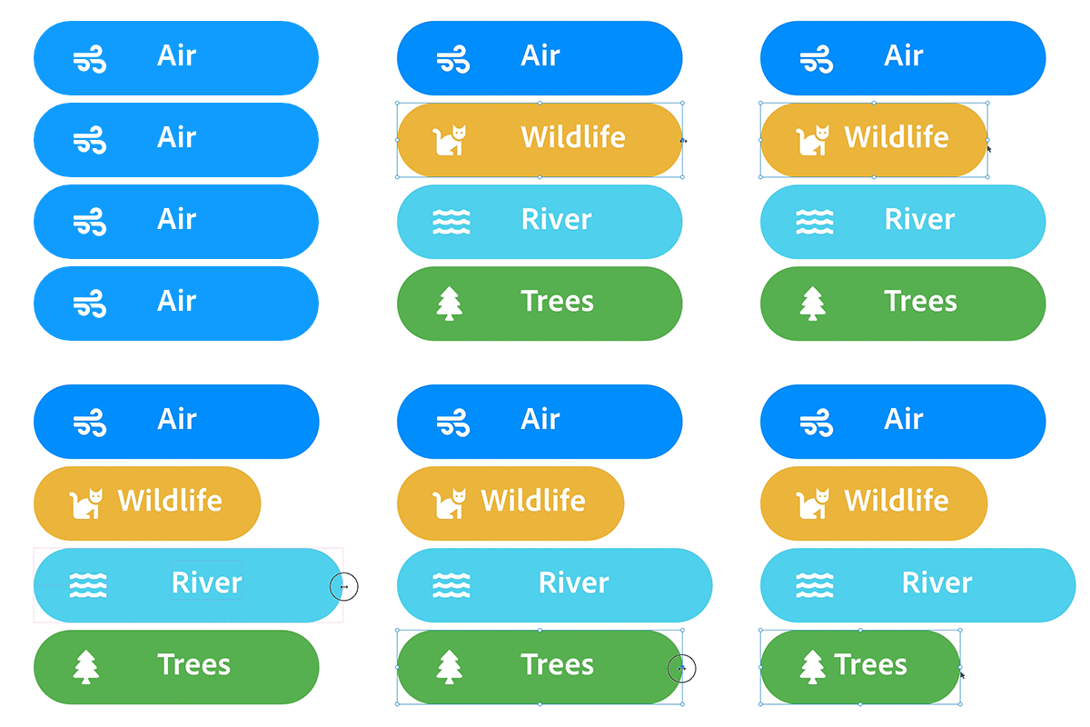

Size Overrides
Components are also resizable and come with the powerful capabilities of responsive resize baked right in. If you resize the Main Component, instances that have not been resized manually as an override are automatically resized. Therefore, instances that have been resized preserve their resized position as an override.
How does resize work in a Main Component or its instances?
- You can independently resize an instance without affecting the Main Component.
- You can you resize an entire Component and alter the layout of the items within.
- You can change the Component instances irrespective of the sizes you’ve adapted them to.
Just like responsive resize, XD re-creates the placement of your elements on a larger or smaller canvas as you resize them.
In the Property Inspector, you can toggle Responsive Resize from Auto to Manual that allows you to edit the constraints for more control.
Appearance overrides


Changing your original elements depending on context is important when creating reusable elements. As a result, you can override every style and appearance property of an instance. The overrides allow for a range of variations while still keeping their ties to the Main Component.
Layout and structure overrides
Not only can you override the size of a Component or the layout of elements within, but you can also structurally override the Components. This means you can add or subtract elements in the Main Component and its instances.
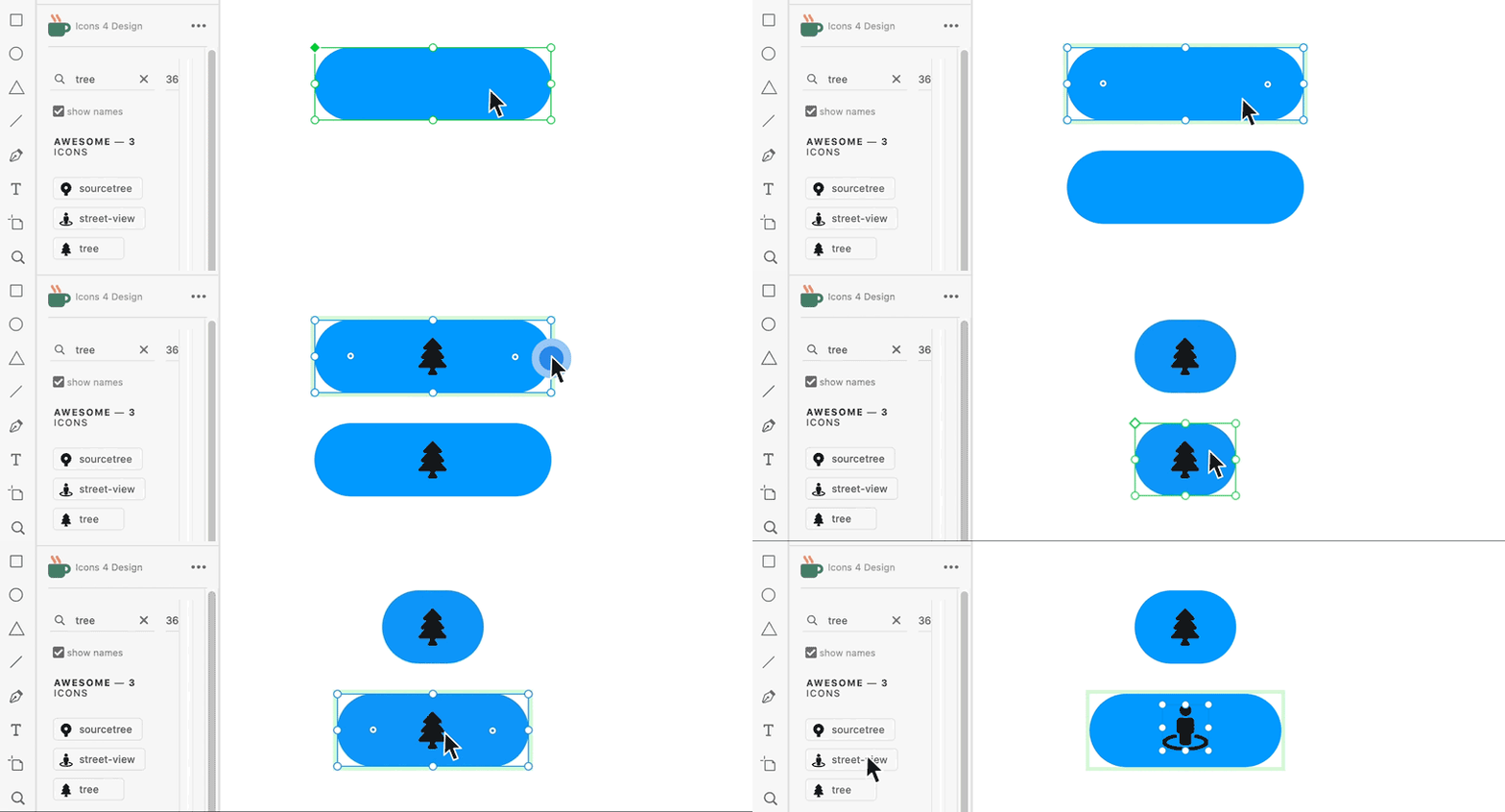

If you add an object to the Main Component, it is also added to its respective instances. When you add an object, XD applies the responsive resize algorithm and automatically places the constraints on the object. This depends on the position of the new object relative to its container. When an object is deleted from the Main Component, it is also removed in all instances.
Elements can also be added or removed from an instance and constraints are automatically placed on an object when it is added. When an element in an instance is deleted, only the element in that instance is removed. The same element continues to exist in the Main Component.
Things to watch out for
- You can reset all the overrides and not individual overrides back to the Main Component.
- If you have marked a property as an override on an instance, select Reset to Main State to get it back in sync with Main.
Best practices
Here are some best practices when working with overrides in Component instances:
- To create a variation of the Component for reuse, create a state in the Main Component rather than an instance with overrides.
- While overriding instances, ensure that you override the property that does not need updates from the Main. For example, in a button Component, overriding the text ensures that the label can be different, but the size and color are still in sync with the Main.
Add states to Components
Component states allow you to save different variations of the Component for each reuse. Once you make overrides on the Main Component, you can create a state out of those overrides so that it can be reused easily.
For example, you can create a button Component with different variations like the primary and secondary. Using states, you can create variations using overrides on the Main Component.
When working with states and Components, remember these pointers:
- States created on the Main Component are available across all the instances of that Component. This allows you to create Components with multiple instances and easily switch states.
- You can rename and delete them from the state switcher in the Property Inspector.
- You can add a trigger with an action to switch from one state of a Component to another state. For example, you can switch from the default to the Hover state while hovering over a button Component.
Add states
Once you have created a Component, the Property Inspector lists the Component with a Default State. You can now add three types of states for your Components: New, Hover, and Toggle.
Create a new state
Use New State for scenarios where you want to show variations of a Component such as a disabled or clicked version of a Component.


In Design mode, click the + button next to the Default State of the Main Component in the Property Inspector, and select New State.
By default, new state does not have any interactivity baked into it. For more information on how to wire an interaction to Components, see Add interactivity to Components.
Create a hover state
Use Hover State if you want the component to change and display a different state when you hover over the Component when interacting with your prototype.


In Design mode, click the + button next to the Default State of the Main Component in the Property Inspector, and select Hover State.
By default, Hover state has interactivity baked within it.
Use Toggle State when you want to create components with interactive toggle behavior such as toggle, radio button, checbox and so on.
?$pjpeg$&jpegSize=200&wid=845)
?$pjpeg$&jpegSize=200&wid=845)
In Design mode, click the + button next to the Default State of the Main Component in the Property Inspector, and select Toggle State.
Once the toggle state is created, by default, XD will automatically bake in two bi-directional Tap interactions between the Default State and the Toggle State, making it fully interactive.
View and manage states
After you create the states for your Component, you can edit the properties of your Component and visualize how your Component appears when you interact with it. Here are some workflows associated with states:
Switch states


Select the Component and from the Property Inspector and toggle or switch between various states.
Rename states


Double-click the component state name in the Property Inspector and add a new name. You can only rename and delete states in the Main Component. You cannot rename the default state.
Delete states


Right-click the component state and select Delete. When you delete a component state from the Main Component, Component instances with the active state switches back to the default state.
Overrides in states
Any edits you make to the default state in the Main Component are propagated to the default state in all instances. Similarly, editing a specific state in the Main Component results in all instances receiving those edits for that specific state. Always make sure you’re editing the state in the Main Component to have it updated across all instances.
With states, you do have the ability to override properties like text, bitmap, size, layout, and appearance. Once you override a state property in an instance, it will no longer receive updates for those properties from the Main Component.
If you are not happy with the results of your overrides, reset it back to the original Main Component by right-clicking an instance and selecting Reset to Main State. This clears all overrides on an instance and resets it back to the Main Component.
Add interactivity
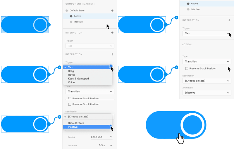
You can use Tap, Hover, Keys & Gamepad, and Voice triggers for wiring interactions between component states in the Prototype mode. Wiring interactions between component states is similar to wiring interactions between artboards. The main difference is that when wiring interactions between component states, you choose a state as a destination instead of an artboard.

-
-
Select the component state from which you want to create the interaction.
-
Click the > icon on the component state or the + in the Interaction section in the Property Inspector to add an interaction.
-
Choose Tap (for click events), Hover (for mouseover actions), Keys & Gamepad (navigation and accessibility use cases), or Voice (navigation and accessibility use cases), as a trigger.
-
Pick an action type (such as Auto-Animate or Transition).
-
Pick a state as the destination.
-
Switch to the Preview window and test your Component's interactivity.
You can define multiple interactions for the same component state. For example, if you have a toggle switch that has both hover and tap states, you can define those interactions by repeating steps 4-7 twice to define the tap and hover states. After you create multiple interactions, you can see the Interaction section displaying the defined interactions. Toggle between those interactions and modify the interaction properties to fit your requirements.
If you want to create nested hover interactions, like flyout menus, or pop-ups with multi-state buttons, you can also nest components with hover states.
Things to watch out for
- When you double-click a Component, the state picker in the Property Inspector disappears.
- XD supports only Tap, Hover, Keys & Gamepad, and Voice as triggers between states.
- XD does not propagate overrides from one state to another state in instances.
Best practices
Here are some best practices when adding states to Components:
- Always create your states for your Components to reuse different variations of it.
- You can switch over to prototype mode and manually edit the interactions between different states.
- When adding interactivity between states, if you are changing properties like color, then pick the action as Transition with None or Dissolve as the animation. If you're animating position or size between states, pick Auto Animate as the action.
- When creating a new state, you can start by replicating the default state or an existing state. Depending on the end goal, you can choose to select the default state and then click + to duplicate it for a new state or select an existing state and then click + to duplicate that state. When you create a new state from an existing state, the new state will also have the same overrides. This means that the overridden properties will not receive any updates from the default state. For most use cases, we recommend creating new states by clicking on + for the default state. Starting with the default state ensures it is in sync with the Main Component and doesn’t contain any overrides.
Manage Components
View


You can view or drag new instances to the canvas from the Assets panel.
To locate all instances, right-click on a Component in the Assets panel and select Highlight on canvas.
To locate Components in the Assets panel, right-click on a Component instance on canvas and select Reveal Component in Assets panel.
Edit, rename, or delete


Right-click a Component in the Assets panel or select an instance on canvas and use the context menu options to edit or delete. To rename Components, right-click and select Rename.
Reset to a Main State


Right-click an instance and select Reset to Main State to clear all overrides and link it back to the Main Component.
To detach an instance from the Main, right-click an instance and select Ungroup a Component.
Add interactivity to Components
You can add interactivity to Components and between states. When you create an interaction on the Main Component, all instances of that Component receive that interaction. Any changes to interactions on the Main Component automatically update the interactions on the instances.
You can also override interactions on instances after which it will no longer receive updates from the Main Component. Just like design overrides, you can override the interaction properties for a Component.
Things to watch out for
- There is no way to prevent propagating interactions from the Main Component to instances.
- There is no way to distinguish between an interaction added to an instance (as an override) versus the interaction it inherited from the Main Component.
- A limited set of actions and triggers are supported for states.
Best practices
Here is a best practice when adding interactivity to a Component:
- When you copy-paste or share Components between documents, XD doesn't preserve the Component to artboard interactions since we can't guarantee that the destination artboards are always available. However, XD preserves the state to state interactions for each Component. What that means is for a Component that has a Hover state and a Tap trigger to an artboard - on pasting this in another document, XD preserves the Hover state interaction and discards the Tap trigger to the artboard.
- Choose when you add an interaction to the Main Component vs the instance.
- If all the instances share the same destination, then wiring the Main Component is more effective since it automatically propagates to all of them. For example, a Home button that goes to the home screen.
- If all the instances or some of them have different destinations then it's easier to wire the individual instances instead of the Main Component. For example, a primary button that is used across the project that has different destinations based on its usage and context.
Learn more
To learn more about working with Components, watch this video.
Viewing time: 9 minutes
What's next?
We've got you started on how to work with Components in XD. Take a step forward and learn how to use nested components in XD.
Have a question or an idea?
Have a question to ask or an idea to share? Come and participate in Adobe XD Community. We would love to hear from you and see your creations!