
Select the widget in the slide.
Last updated on
Nov 3, 2025
- Captivate User Guide
- Get to know Captivate
- Adobe Captivate releases
- Adobe Captivate 13
- Adobe Captivate 12
- Project setup
- Import from PowerPoint
- Import from Captivate Classic
- Generative AI in Adobe Captivate
- Generative AI overview
- Generative AI FAQs
- Generative credits
- Generate text
- Generate images
- Generate avatar
- Generate transcripts
- Add and edit text
- Add and edit images
- Add and edit media
- Interactive components
- Create quizzes
- Add widgets
- Interactions and animations
- Enhance your e-learning project
- Simulation projects
- Timeline and TOC
- Review and collaborate
- Preview and publish
- Accessibility
- Design options in Adobe Captivate
- Additional resources
Learn how to add and configure a carousel widget in an Adobe Captivate project.
Note
Adobe Captivate introduces content blocks, such as text or an image block, which contain components like text, image, or button. Play this video to learn more about content blocks and components.
Overview
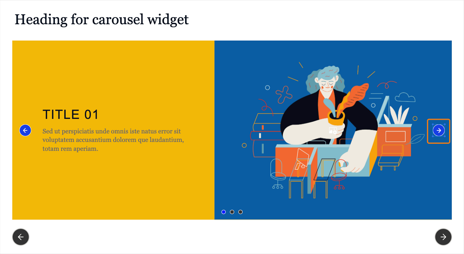
A carousel widget adds an interactive and visually appealing element to eLearning courses in the all-new Adobe Captivate. It allows learners to explore content dynamically and enhances user engagement by providing a hands-on and interactive experience.
The carousel widget allows learners to scroll through the content and view the content in more detail.
Add a Carousel widget
Select Add new widget > Carousel in the left toolbar to add a carousel widget.

Change the properties of the carousel widget
Adobe Captivate lets you increase or decrease the number of pages in a carousel, apply a design option, change the widget's appearance, decide how the pages in the carousel transitions, and much more.
-
-
In the Alignment and Spacing section of the Visual Properties panel, you can adjust the width of the widget. Adjust the slider to increase or decrease the width of the widget. Moving the slider also adds padding to the right and left of the widget.Move the Content spacing slider to increase or decrease the space between the title and the subtitle in the carousel pages.
-
Move the Number of pages to increase or decrease the number of pages in the widget. You can add at most six pages.
-
Select any design option. A design option presents pre-configured layouts with cleaner design elements to apply to the widget.
For more information, view Design options in Adobe Captivate.
-
In the Components section, you can change the following at the widget level:
- Title: Add or remove the title from all pages of the Carousel widget.
- Body: Add or remove the body of the widget
- Instruction: Add or remove the instruction on the widget.
- Previous button: Add or remove the Previous button on the widget.
- Next button: Add or remove the Next button on the widget.
You can add or remove the following inside a carousel:
- Image: Add or remove the image from all pages inside a carousel.
- Heading: Add or remove the heading from all pages inside a carousel.
- Body: Add or remove the body text from all pages inside a carousel.
- Arrows: The arrows help you transition between the carousel pages manually. If a learner selects the previous or next arrow, the previous or next carousel page appears. You can also place the arrows at the top, center, or bottom of the carousel.
- Indicator: Select to display the three dots from all pages inside a carousel.
- Card: Add or remove a card around the text on a carousel page.
NoteYou can align the components in the Components section. Hover over a component and select any option (Align left, Align center, or Align right).
-
If you've enabled Card, you can add color, border, or shadows to the card in the Card tab.
-
In the Appearance section, you can further customize the following:
- Background of the widget: The Background tab controls the color setting at the widget level. Select the Background tab, add the widget's background color and a border, and apply a shadow to the border. Additionally, you can change the color and shape of the indicator on the current page. Select a circular, squared, or dashed indicator from the dropdown. Then select a solid color, linear or radial gradient, or add an image as a background.
- Background of the carousel page: Add the background color of the carousel pages in the Page tab. Select a solid color, linear or radial gradient, or add an image as a background.
- Background of the widget: The Background tab controls the color setting at the widget level. Select the Background tab, add the widget's background color and a border, and apply a shadow to the border. Additionally, you can change the color and shape of the indicator on the current page. Select a circular, squared, or dashed indicator from the dropdown. Then select a solid color, linear or radial gradient, or add an image as a background.
-
In the Settings section, configure the following:
- Page Movement: Select an option to decide how a carousel page transitions to the next page when a learner selects an arrow. The available movement options are Right to left, Top to bottom, or Left to right.
- Auto-play on loading: Enable this toggle to autoplay the carousel pages when a learner previews the project.
- Move to next slide when the widget completes: Enable this toggle for a learner to move to the next slide only after they have visited all the carousel pages.
Change the page movement Change the page movement


Add audio to each page
Enhance the widget's engagement by adding audio cues when learners select a page. The Carousel widget supports an Object appear trigger that plays media for each page interaction. Learn more about how to add audio to widget interactions.
Change the appearance of a carousel page
Change the appearance of a page in the carousel and the card around the text on the page.
-
Select a page in the page selector.
Select a page and change its visual properties. The page selector is available below the widget. Select a page and change its visual properties. The page selector is available below the widget. -
In the Components section of the Visual Properties panel, you can change the following:
- Image: Add or remove an image on a carousel page. Select the image placeholder and replace the default image with an image from Assets or your computer. For more information on working with images, view Images in Adobe Captivate.
- Heading: Add or remove the heading on a carousel page.
- Body: Add or remove the text body on a carousel page.
- Card: Add or remove a card around the text objects.
-
In the Appearance section, change the appearance of the card and the carousel page via the following tabs:
- Page tab: Add the carousel page's background color in the Page tab. Select a solid color, linear or radial gradient, or add an image as a background.
- Card tab: Increase or decrease padding around the text objects, add a radius to one or four corners of the card, add a border to the card, and apply a shadow to the card's border.
- Page tab: Add the carousel page's background color in the Page tab. Select a solid color, linear or radial gradient, or add an image as a background.

Edit text inside a carousel page
Apply a text preset, change font family, apply text alignment, change text indentation, and do much more.
For more information, view Work with text in Adobe Captivate.
-
Select a text object, for example, title or body inside a page.
-
In the Visual Properties panel, change the text style, font, font size, text spacing, etc.
Edit the Next or Previous arrow on a carousel page
The Next or Previous arrow on a carousel page allows a learner to transition between the pages in the carousel widget.
-
Select the Next arrow on a page.
The Visual Properties panel of the arrow opens.
-
In the States section of the Visual Properties panel, click Show to launch the States Flyout. Configure the in-built states of the button, Hover and Disabled. If any state is disabled, right-click the state, and select Enable.
For more information, view States in Adobe Captivate.
-
In the Visual Properties panel in the left toolbar, move the Opacity slider to increase or decrease the transparency of the arrow.
-
Add the arrow's fill color by picking a color from the color picker.

Edit the slide navigation buttons in the widget
The slide navigation buttons (left and right) in the widget allow a learner to go to the next or previous slide in the project.
-
Select a navigation button in the widget.
Select any navigation button to view and change its properties. Select any navigation button to view and change its properties. -
In the Visual Properties panel in the left toolbar, move the Opacity slider to increase or decrease the transparency of the button.
-
Select any design option. A design option presents pre-configured layouts with cleaner design elements to apply to the button.
For more information, view Design options in Adobe Captivate.
-
In the States section, click Show to launch the States Flyout. Configure the in-built states of the button, Hover, Visited, Selected, and Disabled. If any state is disabled, right-click the state, and select Enable.
For more information, view States in Adobe Captivate.
-
In the Appearance section, in the Shape tab, add color and shadows, and apply a border to the button. Select one of the caps (butt, round, projecting) when applying a border.
-
If you've selected a design that contains text or enabled the text toggle, then the text customization properties are displayed. Change the font family, color, and other properties in the Text tab. Enable the Text toggle first.
For more information, view Work with text in Adobe Captivate.
Select the Text tab to change the properties of the text. Select the Text tab to change the properties of the text. -
In the Icon tab, enable the Icon toggle.
The button will be labeled Next only if you've enabled the Text toggle in the Text tab. Label the button as required and add an icon near the label. Select the folder icon and change the icon from the Asset panel or your computer.
-
Select the Solid color checkbox and add the icon's color. To add a border to the icon, select the Border checkbox, and apply a border. Change the thicknesses of the border and specify the border end caps (Butt, Round, or Projecting).
-
Select the icon size from the Small, Medium, or Large options. Then select the position of the icon on the button. Select either:
- Alight Left
- Align Top
- Align Right
- Align Bottom
NoteThe icon position setting works only when you've a combination of text and icon on the navigation button.
-
Select the icon's offset relative to the button. Select either Default, Comfortable, or Compact. Offset adds space between the icon and the edge or border of the button.
-
In the Flip icon section, select Flip horizontally or Flip vertically, so that when a learner selects the icon, the icon flips in the selected mode.

