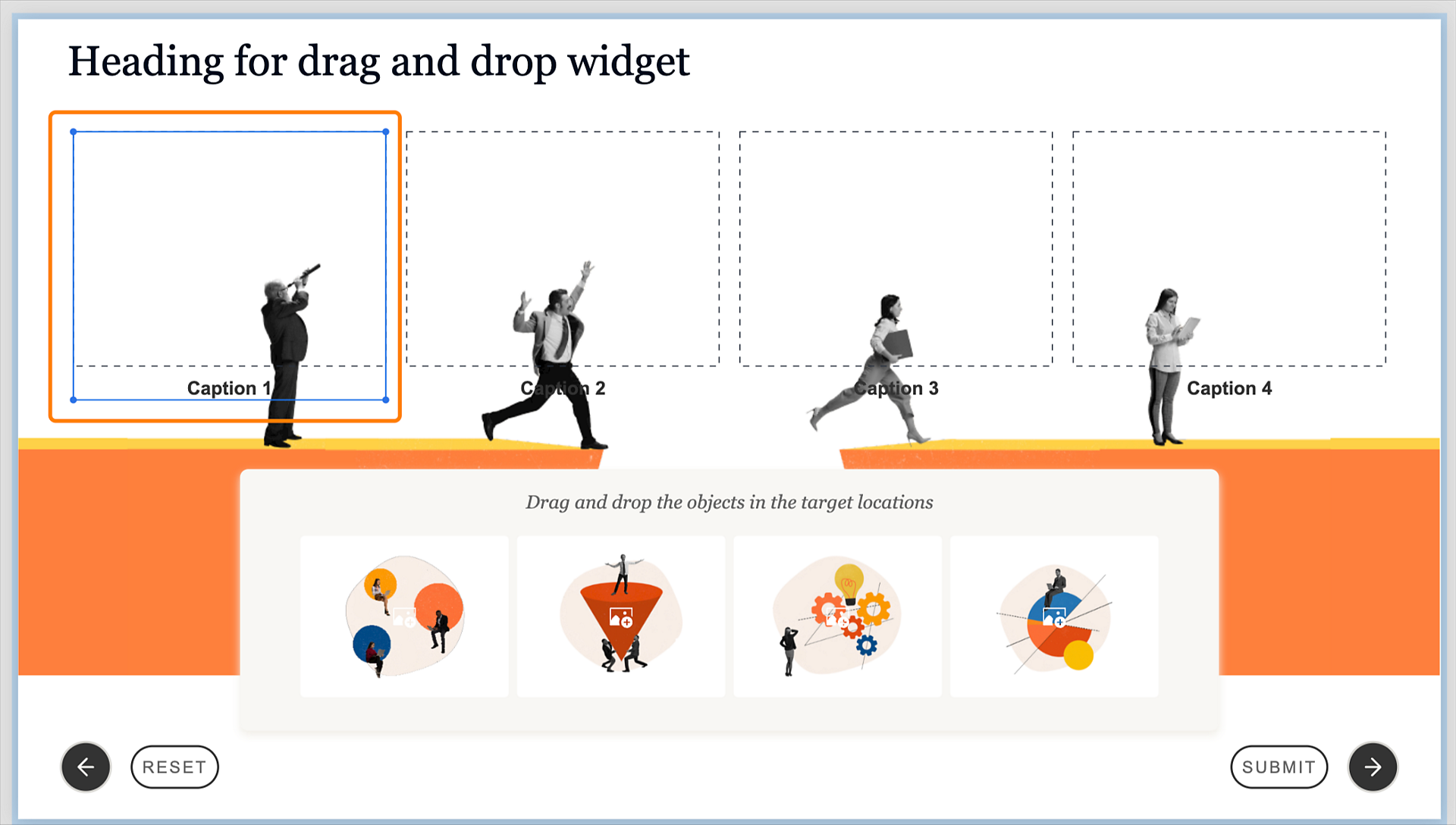
In the Visual Properties panel, select a design option. A design option presents pre-configured layouts with cleaner design elements to apply to the widget.
For more information, view Design options in Adobe Captivate.
Learn more about Drag-and-drop widgets, where learners drag objects from one location and drop them into specific target areas to complete an activity or solve a problem.
Adobe Captivate introduces content blocks, such as text or an image block, which contain components like text, image, or button. Play this video to learn more about content blocks and components.
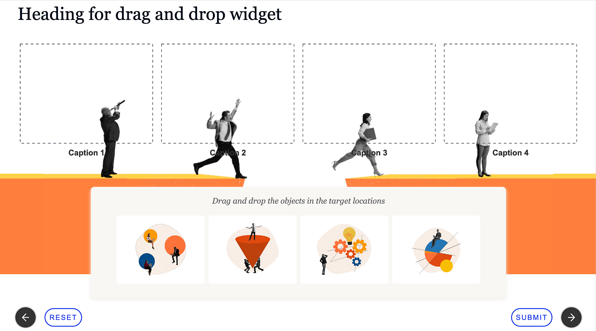
A Drag and drop widget in the all-new Adobe Captivate allows learners to actively participate in learning and apply their knowledge or problem-solving skills. You can use the widget for various purposes, such as matching related items, sequencing steps, or categorizing information. The basic functionality of a drag-and-drop widget involves the following:
Select Add new widget > Drag and drop in the left toolbar.
On the slide, the placeholders above are the drop targets. The placeholders at the bottom are the drag objects.
Add a design option, add or remove the title in the widget, set the number of drop targets and drag source objects, create drag and drop associations, and many more.
In the Visual Properties panel, select a design option. A design option presents pre-configured layouts with cleaner design elements to apply to the widget.
For more information, view Design options in Adobe Captivate.
In the Components section, you can change the following:

You can align the components in the Components section. Hover over a component and select any option (Align left, Align center, or Align right).
In the Connections section, click Configure to define the correct matches between the source and the target drop objects.

Select the correct target from the Drop Target dropdown for each object in the Drag Object group.

After mapping the connections, select the number of attempts a learner gets to match the objects with the targets. You can choose between Single, multiple, custom, or unlimited attempts in the Attempts dropdown.
In the Appearance section, you can control the color settings at the widget level. Add the widget's background color, a border, and apply a shadow to the border. When adding a background, you can select a solid color, linear or radial gradient, or add an image as a background.
If you've selected Drag card in the Components section, you can change the card's appearance in the Card section. Increase or decrease padding around the drag objects, add a radius to one or four corners of the card, add a border, and apply a shadow to the card's border.

Add and customize the captions in the drop targets.
Select Caption 1 in the text component of a drop target.

Enter the text for the selected caption for the drop target.
In the Visual Properties panel, change the properties of the caption. Add a preset, change the font, or add color or shadow to the text.
For more information, view Work with text in Adobe Captivate.
Repeat steps 1-4 to change the caption in the rest of the drop targets.
Change the state, shape, and look and feel of a drop target.
Select a drop target in the widget.
In the States section of the Visual Properties panel, click Show to launch the States Flyout. Configure the states of the drop target, Hover, Drag Over, and Dropped.
In the Appearance section of the Visual Properties panel, you can change the shape of the drop target. Select either a circular or a rectangular shape for the target.

Add color and shadows, and apply a border. Select one of the caps (Butt, Round, or Projecting) when applying a border.
Change the states of a drop target from the States flyout.
Select a drop target in the panel.

In the Visual Properties panel, click Show in the States panel to launch the States flyout.
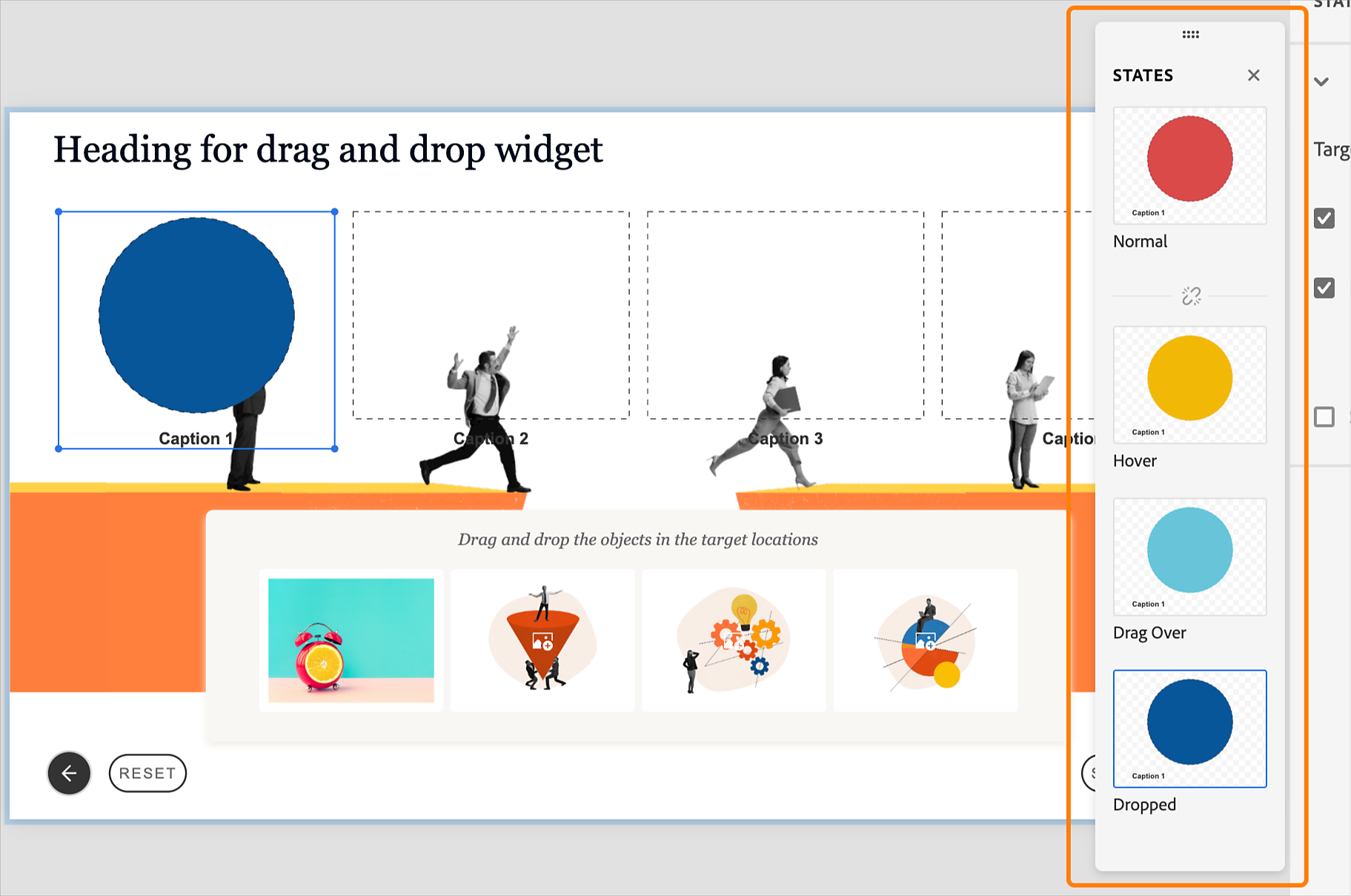
In the States flyout, configure the states of the drag source. The available states are Hover, Drag Over, and Dropped.
In the States flyout, configure the states of the drop targets. The available states are
Change the states of a drag source from the States flyout.
Select a drag source in the panel.

In the Visual Properties panel, click Show in the States panel to launch the States flyout.

In the States flyout, configure the states of the drag source. The available states are
Select the drag source component in the widget.

In the Components section, select the checkbox Instructions to display the instructions in the Visual Properties panel.

Move the Drag objects slider to increase or decrease the number of drag sources.
Select the checkbox Drag card to insert a card container around the drag sources.
Change the visual properties of the drag sources, for example, whether you want text or image, or both in a drag source or add an image in a drag source.
Select the drag source in the widget.
In the Visual Properties panel, select the Object type dropdown to display them as:
Images only: If you select this option, the drag sources contain only images.

Text only: If you select this option, the drag sources contain only text. If you want to edit the text, select the text, and in the Visual Properties panel, change the look and feel of the text. For more information, view Work with text in Adobe Captivate.

Images and text: If you select this option, it will display both images and text on the drag sources. If you want to edit the text, select the text, and in the Visual Properties panel, change the look and feel of the text. For more information, view Work with text in Adobe Captivate.

For any drag source object, you can also replace its image. Select the image placeholder and replace the default image with an image from Assets or your computer. For more information on working with images, view Images in Adobe Captivate.
Once you've replaced the images, select the drag source container.
Select either Fill or Fit.
The Fit option resizes the image to fit within the bounds of its container, whereas the Fill option expands the image to fill the whole container.
Add the drag container's background color and a border in the Appearance section, and apply a shadow to the border. You can also select a solid color, linear or radial gradient, or add an image as a background. You can add padding between the object in the container.
You can also make the corners of a border rounded by specifying the radius of a corner or all corners.
Enhance the widget's engagement by adding audio cues to both drag items and drop targets. Learn more about how to add audio to widget interactions.
The slide navigation buttons (left and right) in the widget allow a learner to go to the next or previous slide in the project.
Select a navigation button in the widget.
In the Visual Properties panel in the right toolbar, move the Opacity slider to increase or decrease the transparency of the button.
Select any design option. A design option presents pre-configured layouts with cleaner design elements to apply to the button.
For more information, view Design options in Adobe Captivate.
In the States section, click Show to launch the States Flyout. Configure the in-built states of the button, Hover, Visited, Selected, and Disabled. If any state is disabled, right-click the state, and select Enable.
In the Appearance section, in the Shape tab, add color and shadows, and apply a border to the button. Select one of the caps (Butt, Round, or Projecting) when applying a border.

If you have selected a design that contains text or enabled the text toggle, then the text customization properties are displayed. Change the font family, color, and other properties in the Text tab. The button is labeled Next.
For more information, view Work with text in Adobe Captivate.

In the Icon tab, enable the Icon toggle.
If you select this option, an icon is added to the button labeled Next. You can change the icon by clicking the folder icon, and changing the icon from Assets or your computer.
Select the Solid color checkbox and add the icon's color. To add a border to the icon, select the Border checkbox, and apply a border. Change the width of the border and specify the border end caps (Butt, Round, Projecting).
Select the icon size from, Small, Medium, or Large. Then select the position of the icon on the button. Select either:
The icon position setting works only when you've got a combination of text and icon on the navigation button.
Select the icon's offset relative to the button. Select either Default, Comfortable, or Compact. Offset adds space between the icon and the edge or border of the button.
In the Flip icon section, select Flip horizontally or Flip vertically, so that when a learner clicks the icon, the icon flips in the selected mode.

Build immersive eLearning experiences with Captivate
Speed up authoring with simplified workflows and ready-to-go slides and assets.